Enhancing Vendor Portal Usability and
User Engagement
Enhancing Vendor Portal Usability and
User Engagement
Enhancing Vendor Portal Usability and
User Engagement
CONTENT
CONTENT
Challenge
Challenge
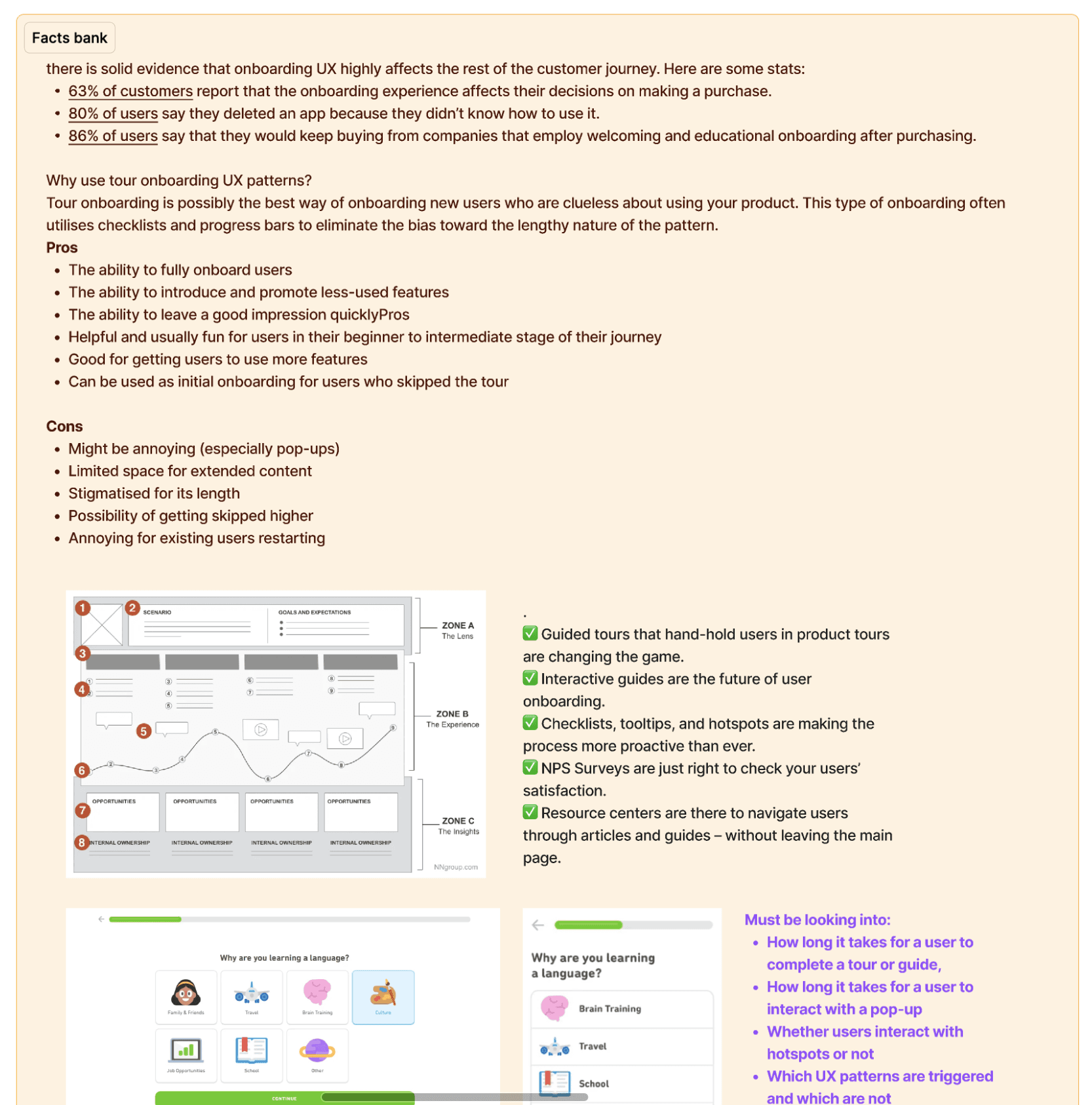
The Peer Insights—Vendor Portal is not aligned with vendor goals and use cases, making the platform difficult for new users to learn and understand. Additionally, the platform lacks engagement features for existing vendors, leading to a poor user experience for new and returning users.
The Peer Insights—Vendor Portal is not aligned with vendor goals and use cases, making the platform difficult for new users to learn and understand. Additionally, the platform lacks engagement features for existing vendors, leading to a poor user experience for new and returning users.
Team
Team
My team included:
• 1 Product Manager
• Development
• UX Researcher
• Sales and Marketing
My team included:
• 1 Product Manager
• Development
• UX Researcher
• Sales and Marketing
Timeline
8 Weeks
8 Weeks
Goals and Success Metrics
Goals and Success Metrics
Through user interviews, we discovered key usability gaps, which guided us in defining success metrics, such as reducing task completion time and improving engagement.
Through user interviews, we discovered key usability gaps, which guided us in defining success metrics, such as reducing task completion time and improving engagement.
Goal
Goal
Metric
Metric
Improve the engagement of vendor users
Improve the engagement of vendor users
Activate 15% in every cohort
Activate 15% in every cohort
Improve the engagement of vendor users
Improve the engagement of vendor users
Increase monthly vendor engagement by 60% QoQ
Increase monthly vendor engagement by 60% QoQ
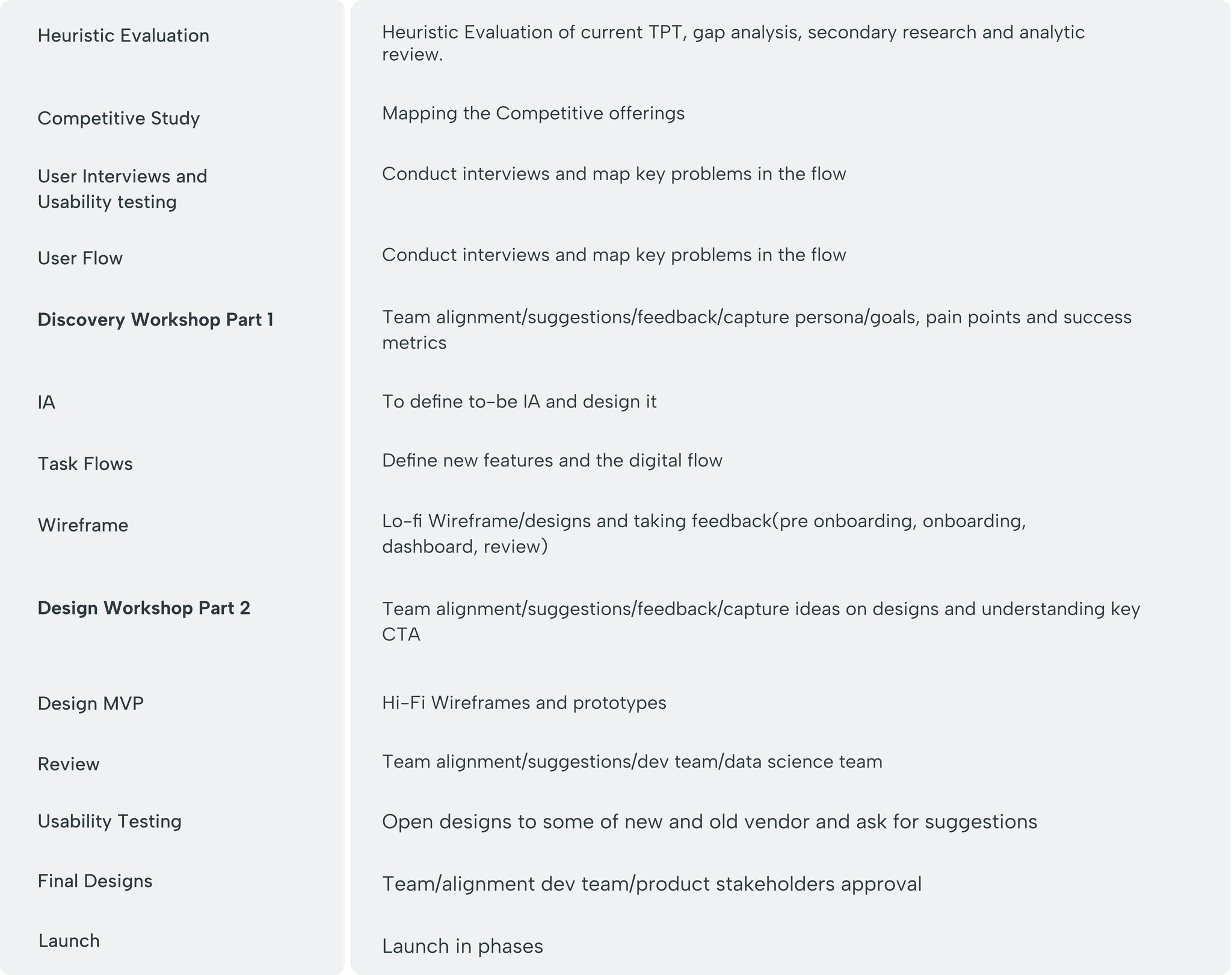
Design Process Followed in this Journey
Design Process Followed in this Journey
Design Process Followed in this Journey
Take a look at the design process we followed. We began by creating a UX roadmap to understand the vendor portal. This helped us to align with the platform's needs and set a clear direction for the design.
Take a look at the design process we followed. We began by creating a UX roadmap to understand the vendor portal. This helped us to align with the platform's needs and set a clear direction for the design.
Helpful Tip
If you’ve jumped straight into this case study and are wondering what Gartner Peer Insights is all about 🤯, I’d suggest checking it out first—it’ll make things a lot clearer as you go through!
Helpful Tip
If you’ve jumped straight into this case study and are wondering what Gartner Peer Insights is all about 🤯, I’d suggest checking it out first—it’ll make things a lot clearer as you go through!
Helpful Tip
If you’ve jumped straight into this case study and are wondering what Gartner Peer Insights is all about 🤯, I’d suggest checking it out first—it’ll make things a lot clearer as you go through!
Understanding the Portal and User Research
Understanding the Portal and User Research
Understanding the Portal and User Research
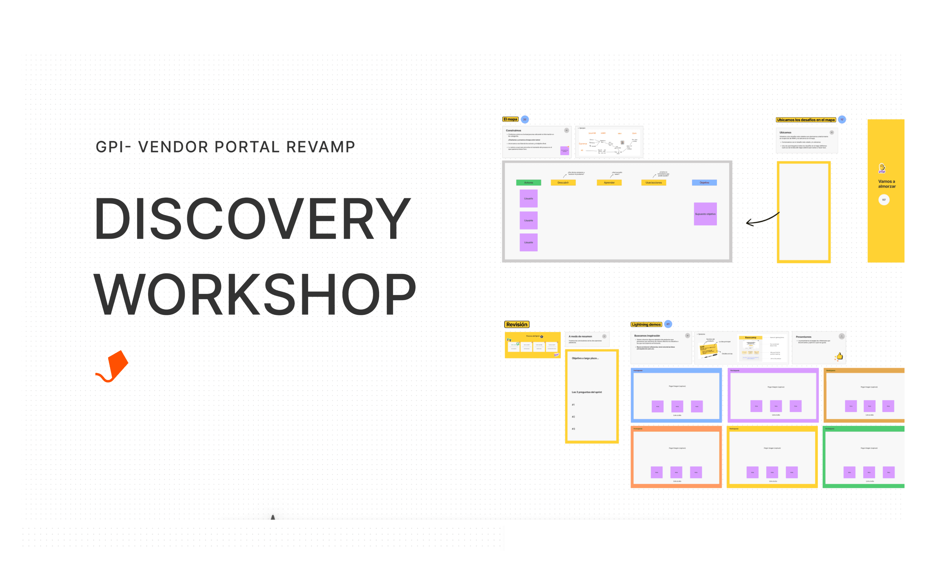
Discovery Workshop
Discovery Workshop
We conducted a UX workshop with key stakeholders from product, data, engineering, and other relevant teams. The workshop was intensive and focused on understanding the personas, their motivations for accessing the vendor portal, their journey, and the success metrics. It provided valuable insights that helped shape the direction of the project.
We conducted a UX workshop with key stakeholders from product, data, engineering, and other relevant teams. The workshop was intensive and focused on understanding the personas, their motivations for accessing the vendor portal, their journey, and the success metrics. It provided valuable insights that helped shape the direction of the project.
You'll need Figma to access this.
You'll need Figma to access this.
The workshop was a great success, The workshop was highly successful, offering valuable insights from stakeholders and unique ideas for solving the problem. Key outcomes included:
Defining primary and secondary personas.
Identifying the personas' main goals, pain points, and needs.
Aligning the team around a shared goal and vision.
Generating ideas to improve the user experience.
Mapping key challenges and the value proposition of the Vendor Portal.
These results helped the UX team develop a high-level information architecture and start designing the new Vendor Portal.
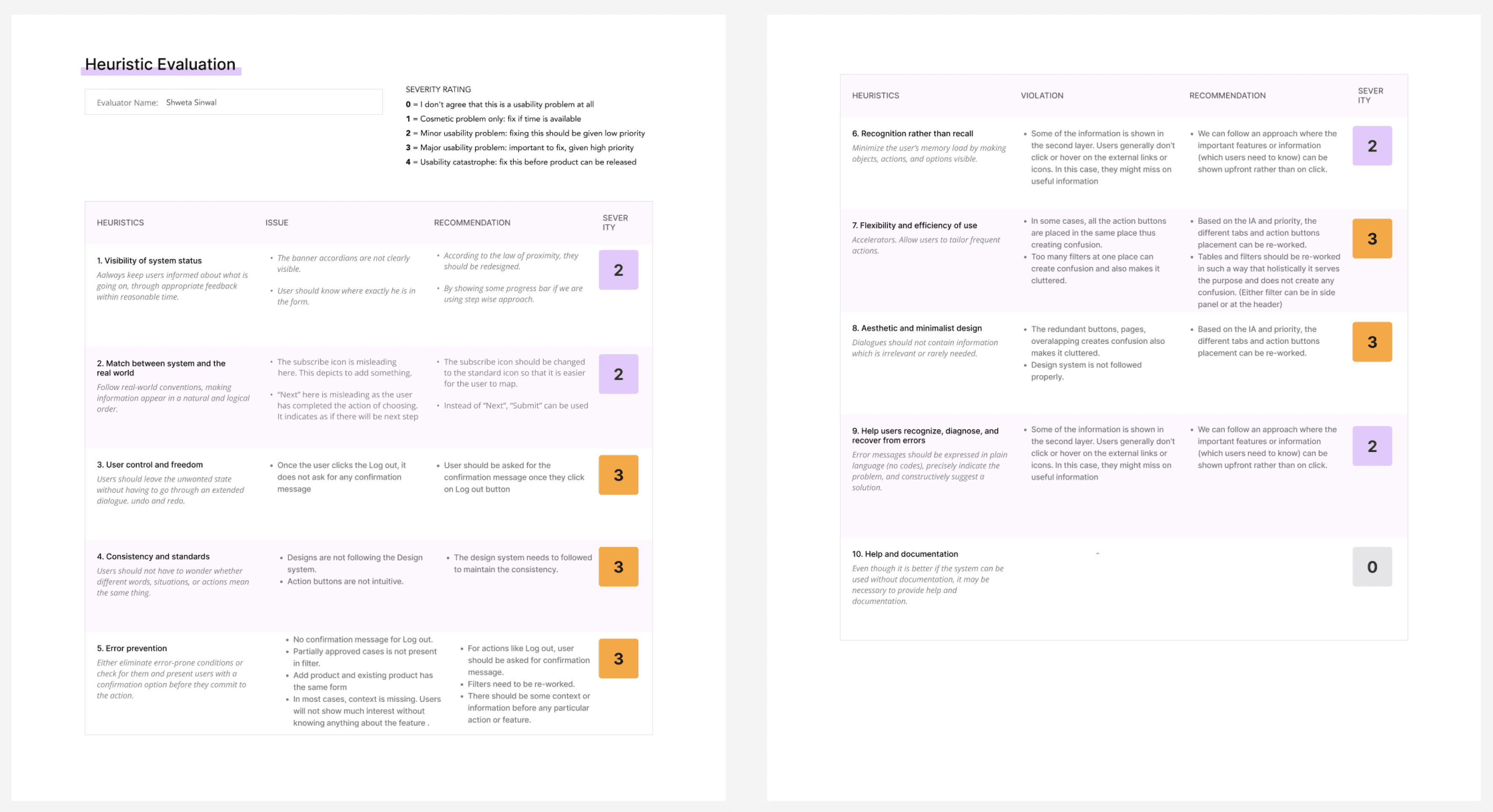
Heuristic Evauation
Heuristic Evauation
You'll need Figma to access this.
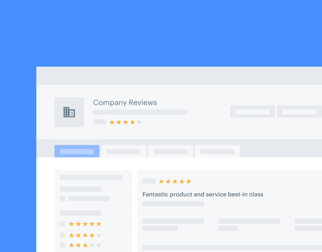
Current User Journey
Current User Journey
Here is the simplified user journey from above image:
Here is the simplified user journey from above image:
User Interviews
User Interviews
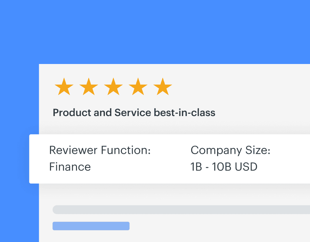
Listing some (April 2023) vendor quotes below in relation to the requirement of UX revamp -
• Hunter Digital - ‘I find the platform a bit confusing which is why we haven't used it yet. For example, we are listing under Markets as "Customer Relationship Management - Others". This is one category for us, but not even our primary one. We are a digital marketing agency that offers paid search and paid social media marketing. We also offer email/sms marketing, marketing strategy, CRM marketing, SEO, etc.'
• Valuefirst - ‘I could use some help. Struggling with the platform and how to best use it.’
• BrandOps - ‘Added logo because it was the only thing they could do after being rejected to add to markets (added to 'Others' instead). Made second request to move but claimed to not hear back - just now checked and saw they were approved in market. Does not understand the concept/value of creating a review sourcing link to send to customers. Under impression that they are done once they create their listings for people to see/write reviews to.’
• Encora - ‘I could use some help with this. I know there is a lot of reference documentation but it's daunting and I think it's more expedient for a 15 min call for you to walk me through everything.’
• Snic Solutions - ‘We sent review sourcing link to customers but did not get any responses.
Insights and Key Users
Insights and Key Users
51% users were from marketing and customer facing area
34% users are Product Managers and analyst relations and CEO
15% users were from sales or business analyst background
51% users were from marketing and customer facing area
34% users are Product Managers and analyst relations and CEO
15% users were from sales or business analyst background
1
1
Not enough insights
Current Vendor Portal fails to deliver quick insights, display essential KPIs, or provide clear action steps, putting us behind competitors.
Not enough insights
Current Vendor Portal fails to deliver quick insights, display essential KPIs, or provide clear action steps, putting us behind competitors.
Not enough insights
Current Vendor Portal fails to deliver quick insights, display essential KPIs, or provide clear action steps, putting us behind competitors.
2
2
Weak self learning
Weak self learning
New users find it hard to use the platform again. And there are no tutorial videos or guides to help them, which makes them feel less motivated.
New users find it hard to use the platform again. And there are no tutorial videos or guides to help them, which makes them feel less motivated.
3
3
User experience challenges
User experience challenges
User experience challenges
There are no clear paths for users, many processes are incomplete, leading to more rejections and failing to meet the needs of users according to their personas.
There are no clear paths for users, many processes are incomplete, leading to more rejections and failing to meet the needs of users according to their personas.
4
4
One Gartner
One Gartner
Deliver a One Gartner experience to reduce time to customer insights, in journeys, design, voice, and tone.
Deliver a One Gartner experience to reduce time to customer insights, in journeys, design, voice, and tone.
Opportunity🤌
How might we ensure the vendor portal is intuitive, engaging, and helpful for first-time users while aligning seamlessly with the design system?
Opportunity🤌
How might we ensure the vendor portal is intuitive, engaging, and helpful for first-time users while aligning seamlessly with the design system?
Opportunity🤌
How might we ensure the vendor portal is intuitive, engaging, and helpful for first-time users while aligning seamlessly with the design system?
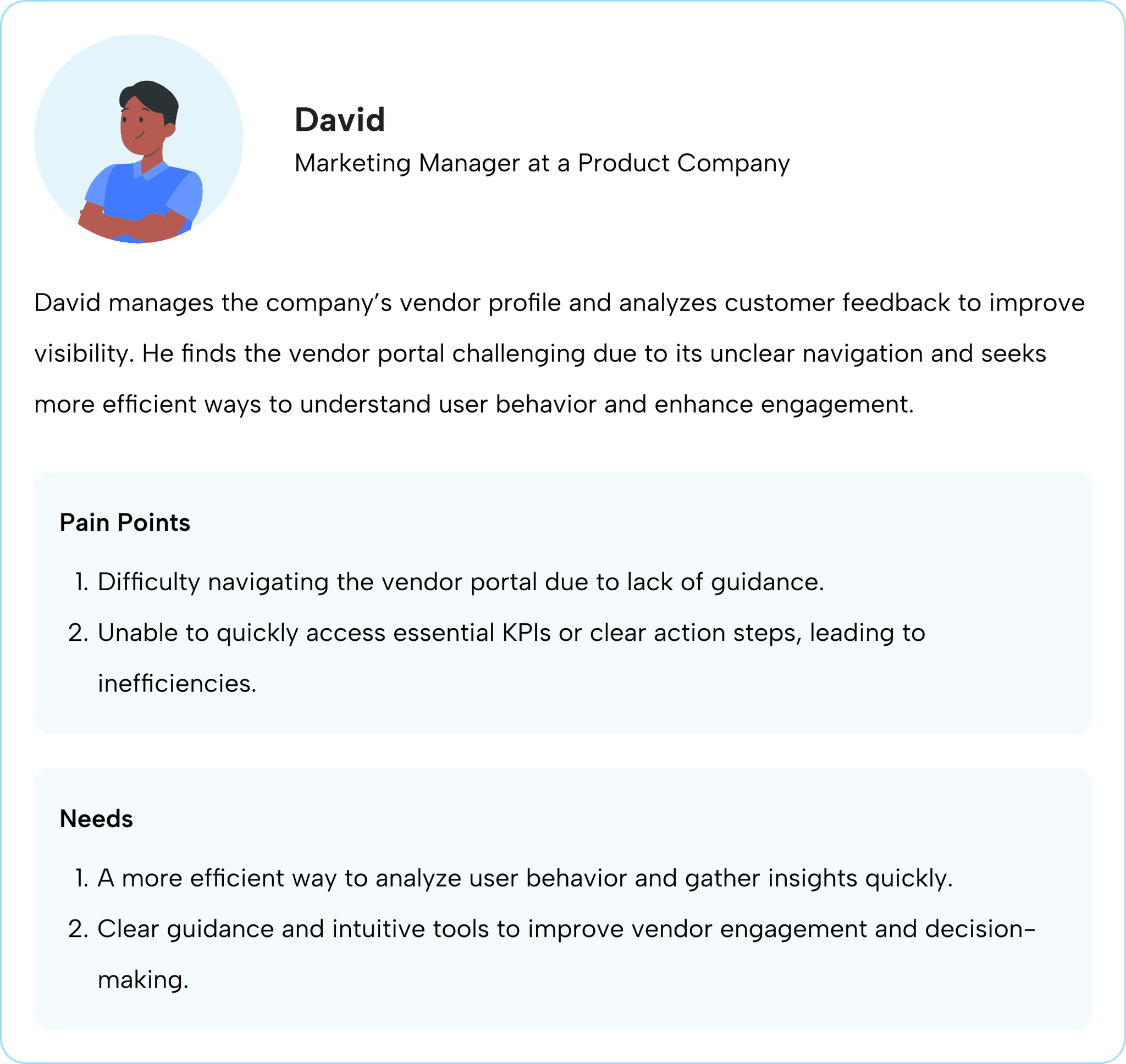
Proto Persona
Proto Persona
I created a proto persona to provide a clear picture of our target users. This will help us stay focused on their needs throughout the project.
I created a proto persona to provide a clear picture of our target users. This will help us stay focused on their needs throughout the project.
Developing the Approach for Solution
Developing the Approach for Solution
Through user interviews and data analysis, we found that many users, especially newcomers, struggled to understand the platform's capabilities. They faced navigation challenges and felt unsupported, leading to disengagement after their first use and difficulty returning.
Through user interviews and data analysis, we found that many users, especially newcomers, struggled to understand the platform's capabilities. They faced navigation challenges and felt unsupported, leading to disengagement after their first use and difficulty returning.
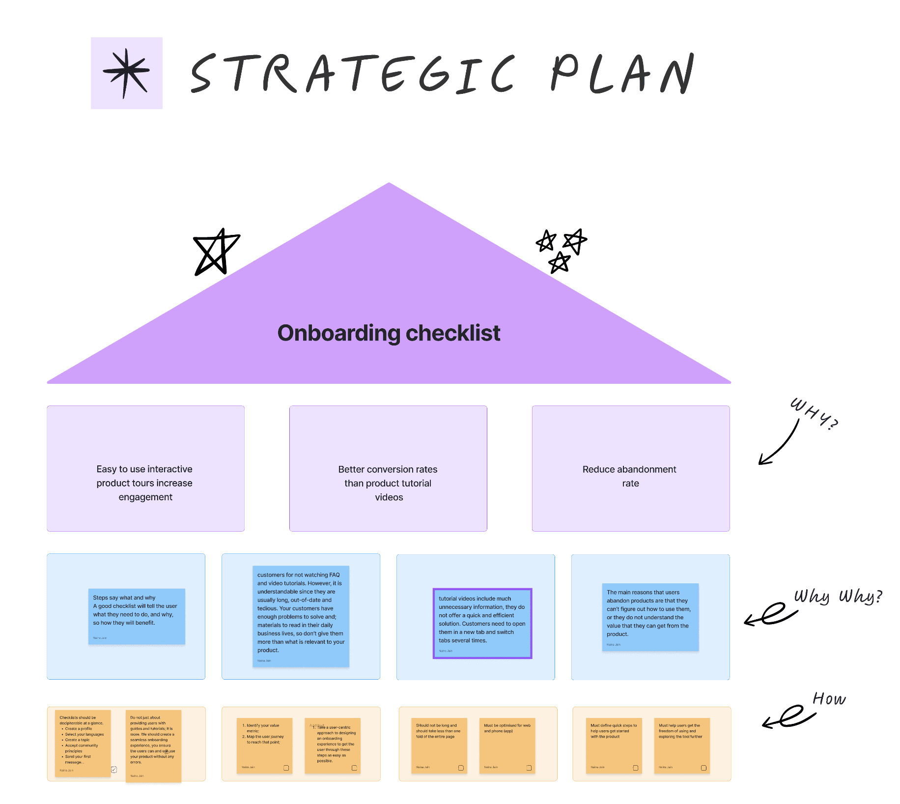
Improving User Engagement Through Intuitive Onboarding
Improving User Engagement Through Intuitive Onboarding
To address this, we prioritized designing an intuitive and engaging onboarding experience. Our focus was to create resources that would guide users from the moment they sign up, helping them understand how to get started and what to expect. The goal was to provide a seamless introduction to the platform that would boost confidence, improve retention, and increase engagement from day one.
To address this, we prioritized designing an intuitive and engaging onboarding experience. Our focus was to create resources that would guide users from the moment they sign up, helping them understand how to get started and what to expect. The goal was to provide a seamless introduction to the platform that would boost confidence, improve retention, and increase engagement from day one.
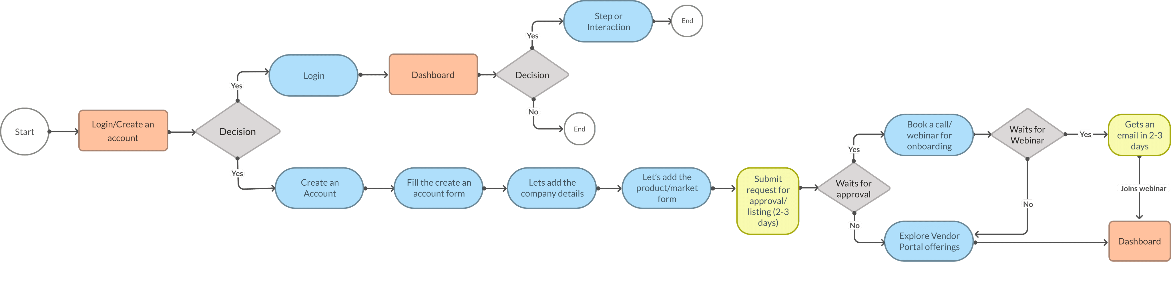
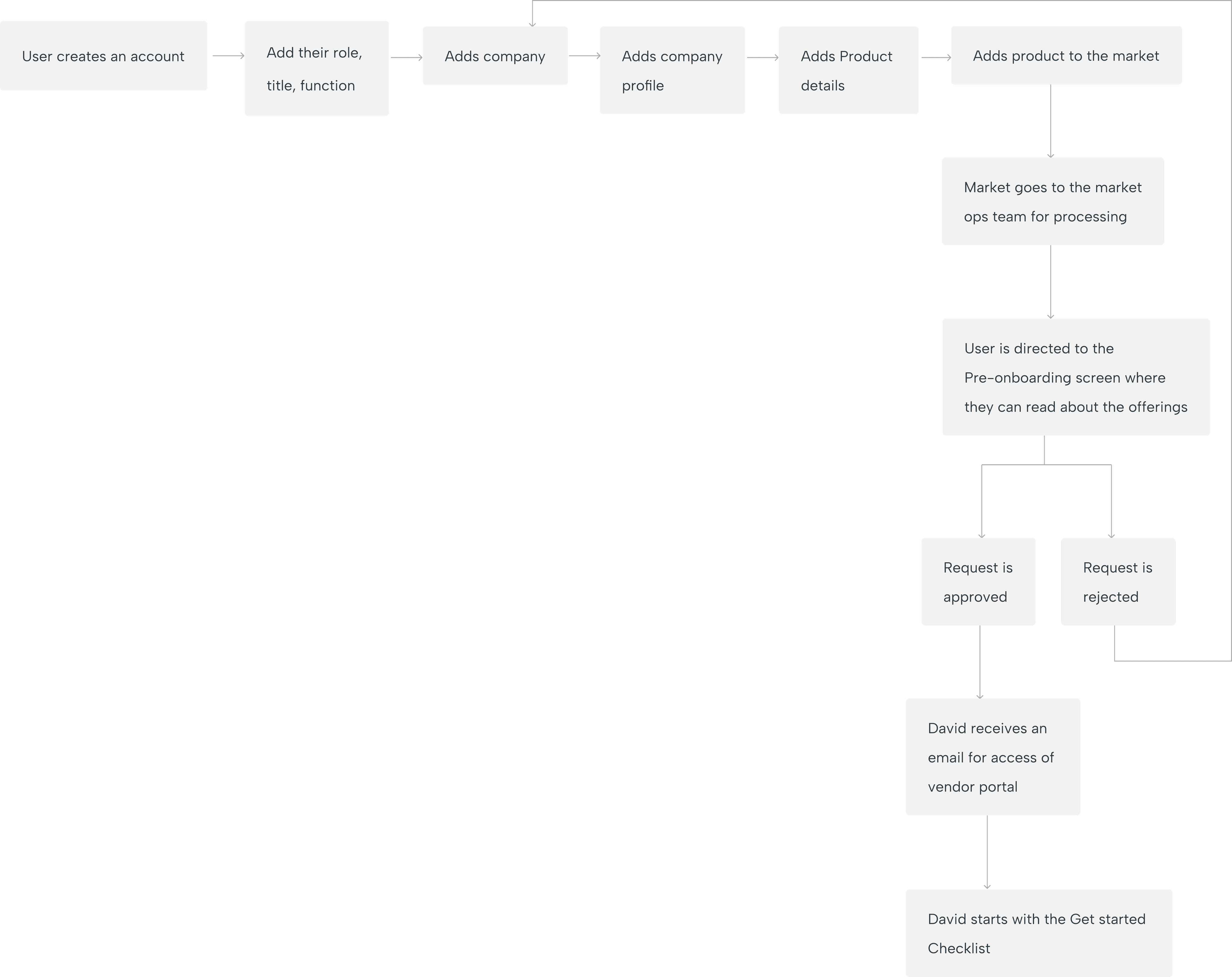
The Proposed User Flow
The Proposed User Flow
It's a Show Time for Designs!
It's a Show Time for Designs!
It's a Show Time for Designs!
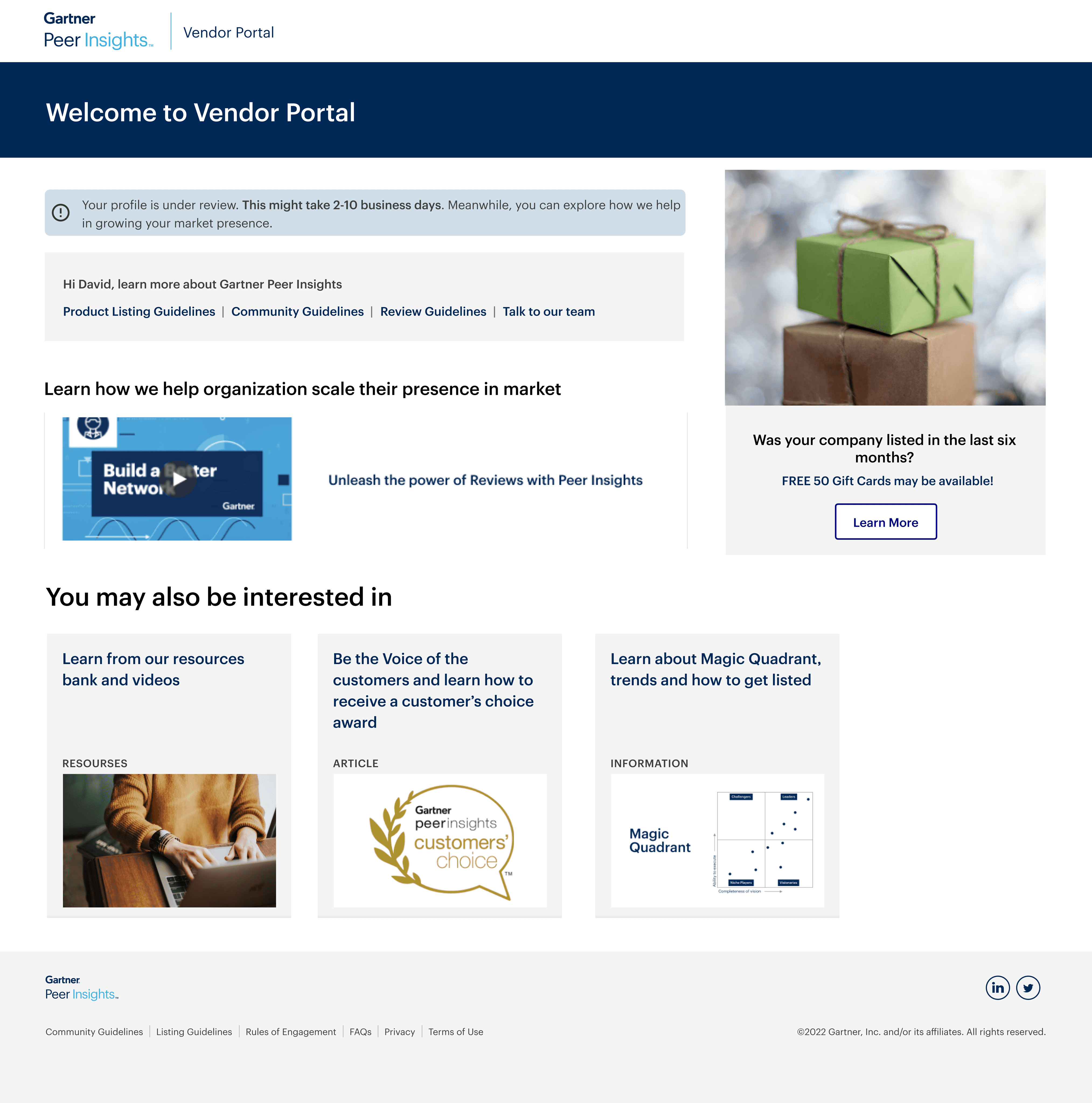
Once their request is processed, users are directed to the Pre-Onboarding screen, where they can learn about the Vendor Portal and its offerings. We regularly update this page to keep users informed about the latest features and product updates.
Once their request is processed, users are directed to the Pre-Onboarding screen, where they can learn about the Vendor Portal and its offerings. We regularly update this page to keep users informed about the latest features and product updates.
Snapshot of pre-onboarding screen
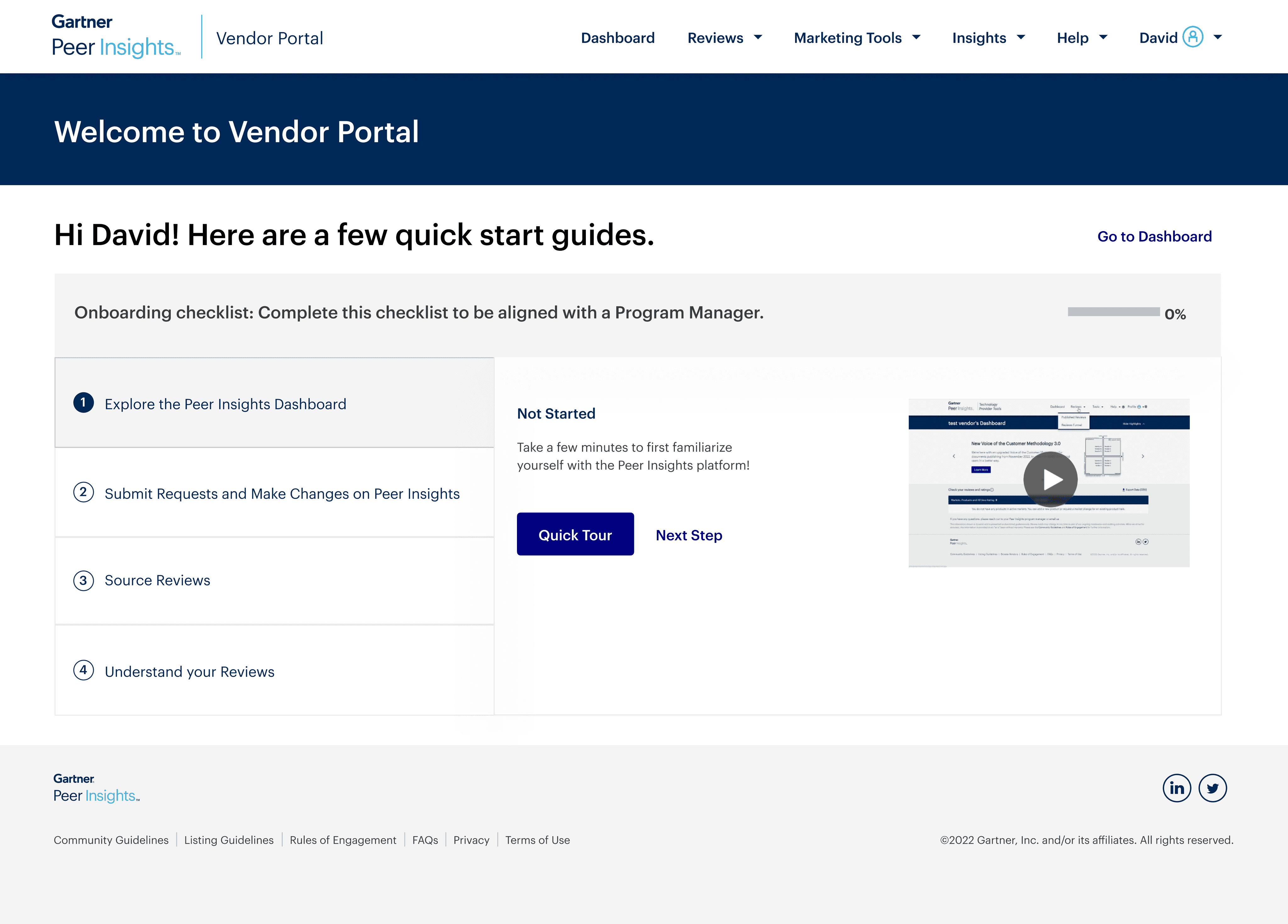
Snapshot of onboarding screen
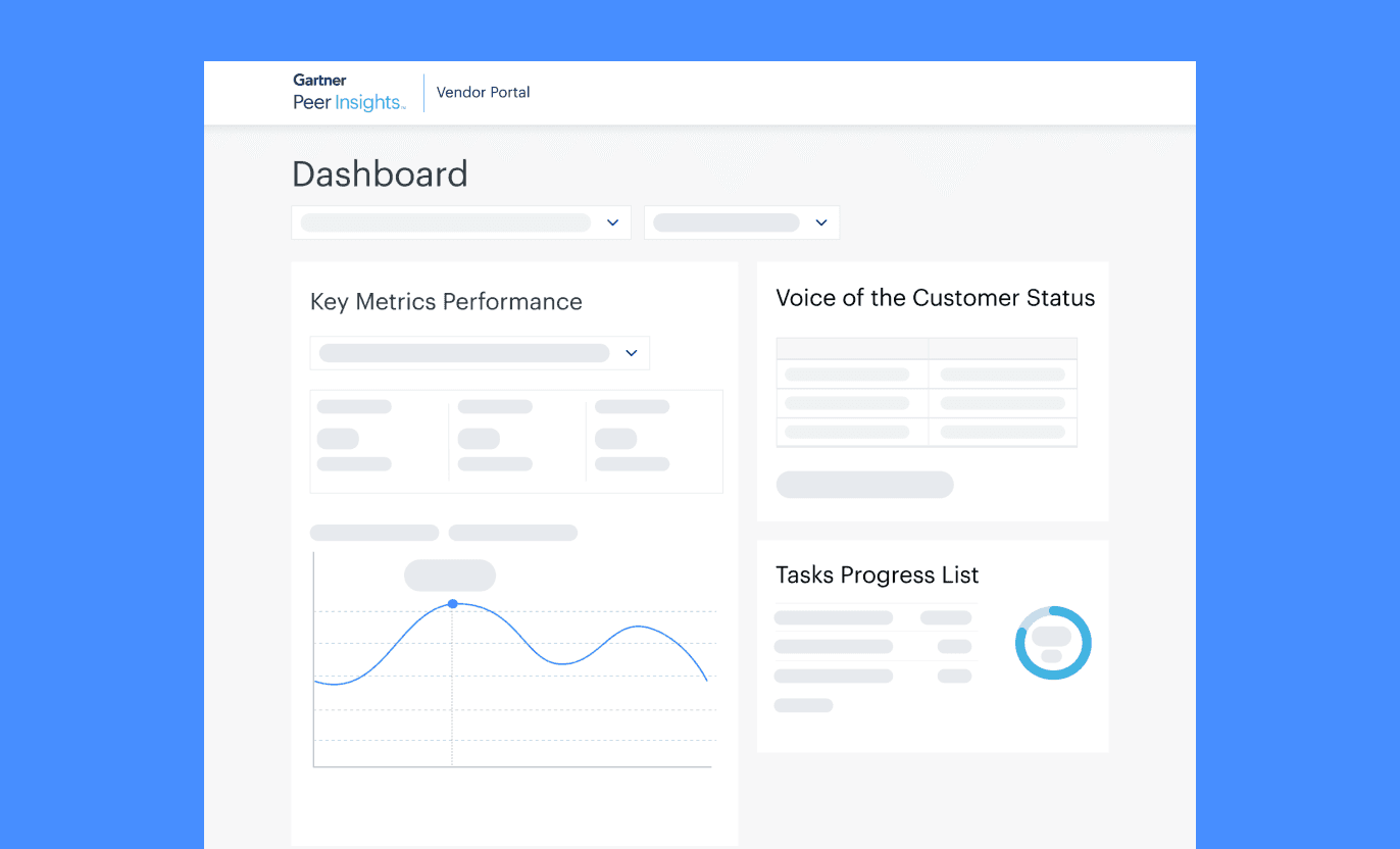
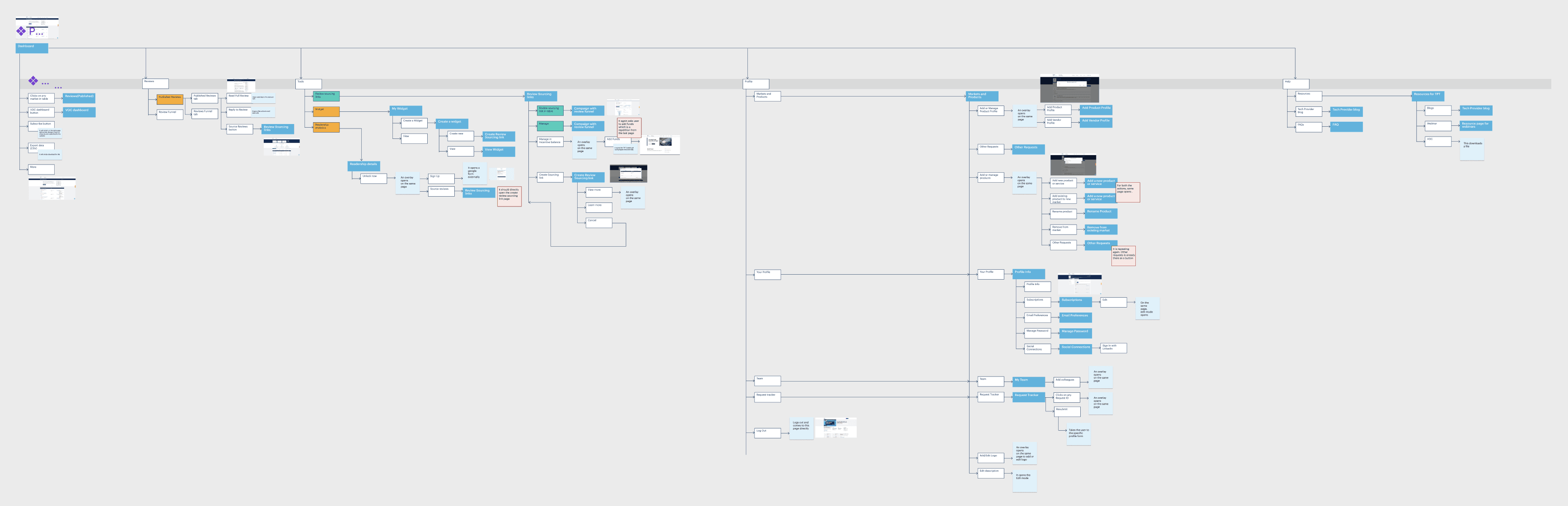
Next Step - Dashboard Revamp
The plan is to revamp the Vendor Portal, improve its information architecture, and navigate and revamp legacy pages to align with the design system. However, we prioritized redesigning the Dashboard first due to its critical role in user engagement and navigation.
Next Step - Dashboard Revamp
The plan is to revamp the Vendor Portal, improve its information architecture, and navigate and revamp legacy pages to align with the design system. However, we prioritized redesigning the Dashboard first due to its critical role in user engagement and navigation.
Next Step - Dashboard Revamp
The plan is to revamp the Vendor Portal, improve its information architecture, and navigate and revamp legacy pages to align with the design system. However, we prioritized redesigning the Dashboard first due to its critical role in user engagement and navigation.
Other Projects I worked on at Gartner