CONTENT
Overview
Overview
The dashboard revamp aimed to enhance user engagement and streamline navigation within the Vendor Portal. By prioritizing the redesign, we focused on creating a more intuitive interface that aligns with user needs and supports key actions. The updated dashboard improves usability and serves as a central hub for accessing essential features, driving a better overall experience for users.
The dashboard revamp aimed to enhance user engagement and streamline navigation within the Vendor Portal. By prioritizing the redesign, we focused on creating a more intuitive interface that aligns with user needs and supports key actions. The updated dashboard improves usability and serves as a central hub for accessing essential features, driving a better overall experience for users.
Team
Team
My team included:
• 1 Product Manager
• Development
• UX Researcher
• Sales and Marketing
My team included:
• 1 Product Manager
• Development
• UX Researcher
• Sales and Marketing
Timeline
Timeline
8 weeks
8 weeks
Why Dashboard Revamp?
Why Dashboard Revamp?
Why Dashboard Revamp?
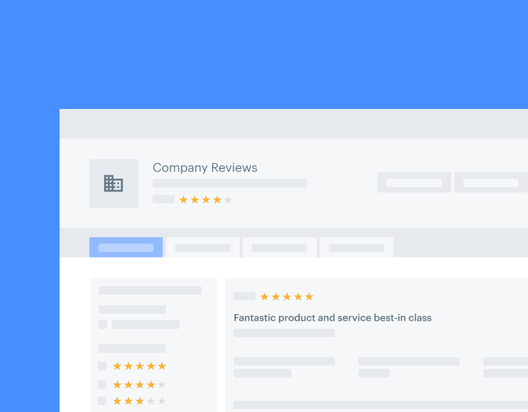
A vendor's journey begins on the dashboard page of Vendor Portal.
A vendor's journey begins on the dashboard page of Vendor Portal.
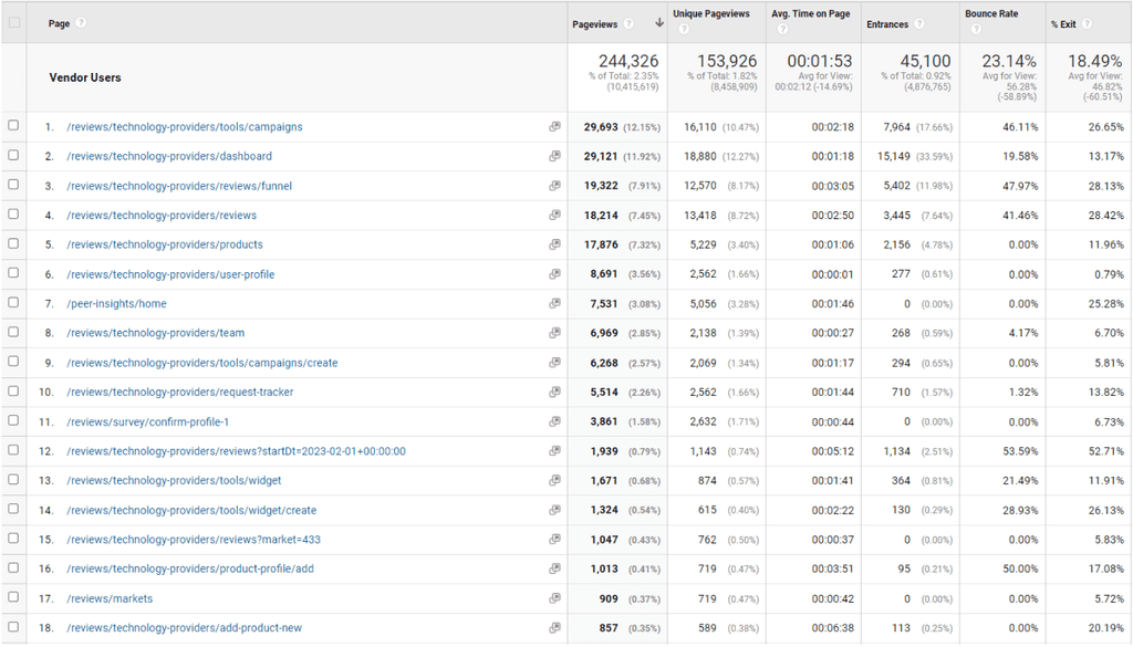
According to Google Analytics , the most visited page is the campaigns page, followed by the dashboard, funnel page,
published reviews, and products page, in that order.
According to Full Story, the dashboard is the most visited page, followed by the published reviews, campaigns, funnel page, Voice of the Customer standing, and product page, in that order
Let's look at from the data point of view
Let's look at from the data point of view
At the time, our Dashboard page led in terms of pageviews, accounting for 12% of all pageviews, and entrances, making up one-third of all entrances. This data, sourced from Google Analytics, covered the period from January 1, 2023, to May 24, 2023.
At the time, our Dashboard page led in terms of pageviews, accounting for 12% of all pageviews, and entrances, making up one-third of all entrances. This data, sourced from Google Analytics, covered the period from January 1, 2023, to May 24, 2023.
But…
But…
Despite these figures, the average time spent on this page is 30% less than the average time spent across all vendor portal (1:20 for for the dashboard page vs. 2.00 across all Vendor Portal).
Despite these figures, the average time spent on this page is 30% less than the average time spent across all vendor portal (1:20 for for the dashboard page vs. 2.00 across all Vendor Portal).
At the time, our Dashboard page led in terms of pageviews, accounting for 12% of all pageviews, and entrances, making up one-third of all entrances. This data, sourced from Google Analytics, covered the period from January 1, 2023, to May 24, 2023.
But…
Despite these figures, the average time spent on this page is 30% less than the average time spent across all vendor portal (1:20 for for the dashboard page vs. 2.00 across all Vendor Portal).
The target is
The target is
Our target is to increase the time spent on the dashboard page to 2:00 by the end of 2023.
Our target is to increase the time spent on the dashboard page to 2:00 by the end of 2023.
Our target is to increase the time spent on the dashboard page to 2:00 by the end of 2023.
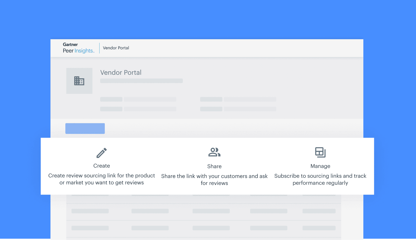
Helpful Tip
If you’ve jumped straight into this case study and are wondering what Gartner Peer Insights is all about 🤯, I’d suggest checking it out first—it’ll make things a lot clearer as you go through!
Helpful Tip
If you’ve jumped straight into this case study and are wondering what Gartner Peer Insights is all about 🤯, I’d suggest checking it out first—it’ll make things a lot clearer as you go through!
Current Dashboard Analysis
Current Dashboard Analysis
Current Dashboard Analysis
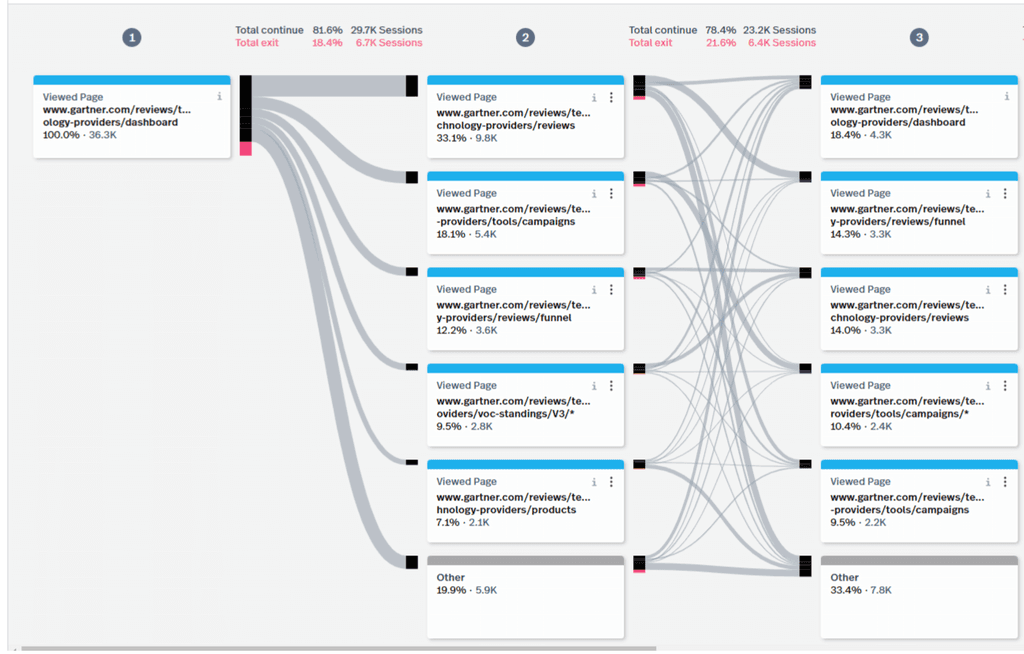
We did some initial analysis on the user journey on dashboard. We looked at Full story sessions and did user interviews. As shown in the image below there is not much engagement with the dashboard page (Vendors mostly head to other pages such as Reviews, end-user site, etc.), nor is there much to interact with.
We did some initial analysis on the user journey on dashboard. We looked at Full story sessions and did user interviews. As shown in the image below there is not much engagement with the dashboard page (Vendors mostly head to other pages such as Reviews, end-user site, etc.), nor is there much to interact with.
Reference - FullStory - Interactions (Heat Map) and viewing >10 user sessions)
In addition, most of the interaction occurs within the first market view. Beyond the second market view, interaction significantly decreases (vendors do scroll though).
In addition, most of the interaction occurs within the first market view. Beyond the second market view, interaction significantly decreases (vendors do scroll though).
Scroll Depth
Based on the analysis and user engagement rankings, here’s how users are currently interacting with the dashboard:
- Primary Purpose: Users primarily visit the dashboard to navigate to specific sections rather than engage directly with its content.
- Top Actions:
Clicking on the market link to access the published reviews section for that market.
Navigating to the VOC dashboard to check eligibility.
Viewing specific product reviews and ratings for a particular market.
This indicates that the dashboard is being used more as a navigational hub than an interactive resource.
Based on the analysis and user engagement rankings, here’s how users are currently interacting with the dashboard:
Primary Purpose: Users primarily visit the dashboard to navigate to specific sections rather than engage directly with its content.
Top Actions:
Clicking on the market link to access the published reviews section for that market.
Navigating to the VOC dashboard to check eligibility.
Viewing specific product reviews and ratings for a particular market.
This indicates that the dashboard is being used more as a navigational hub than an interactive resource.
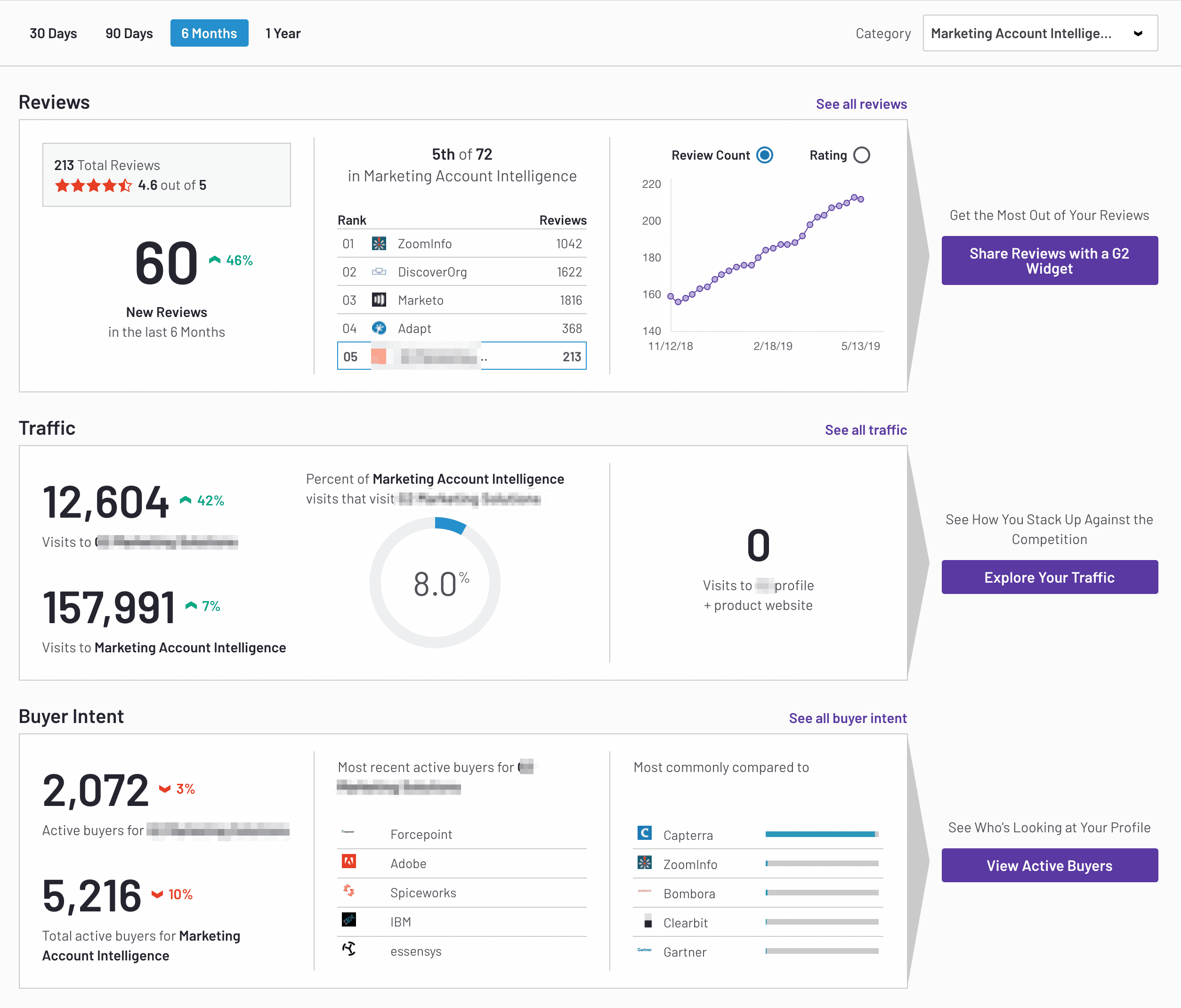
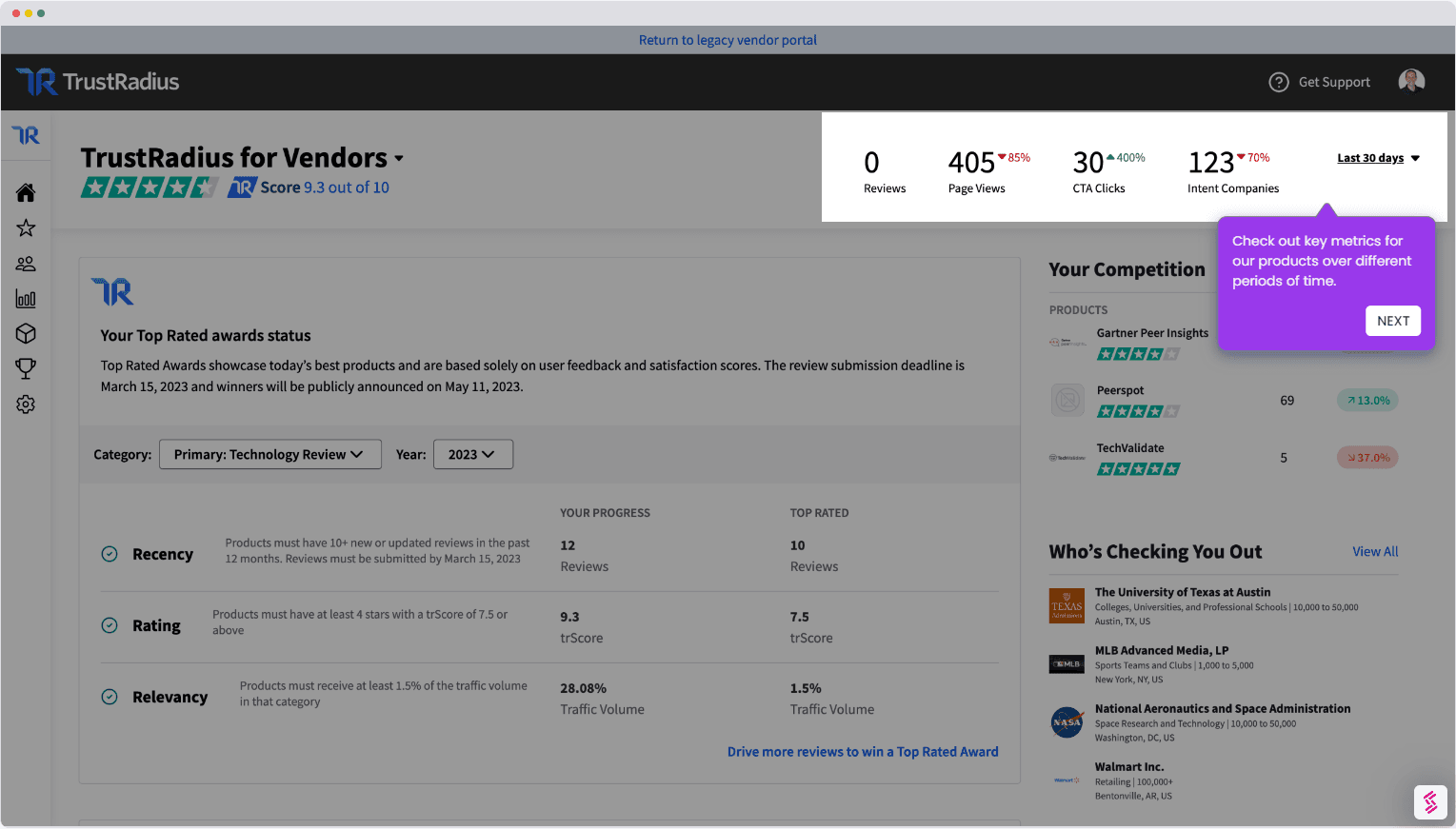
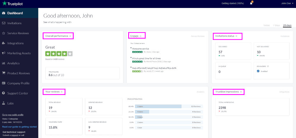
Competitive Analysis
Competitive Analysis
Competitive Analysis
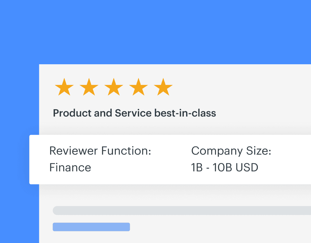
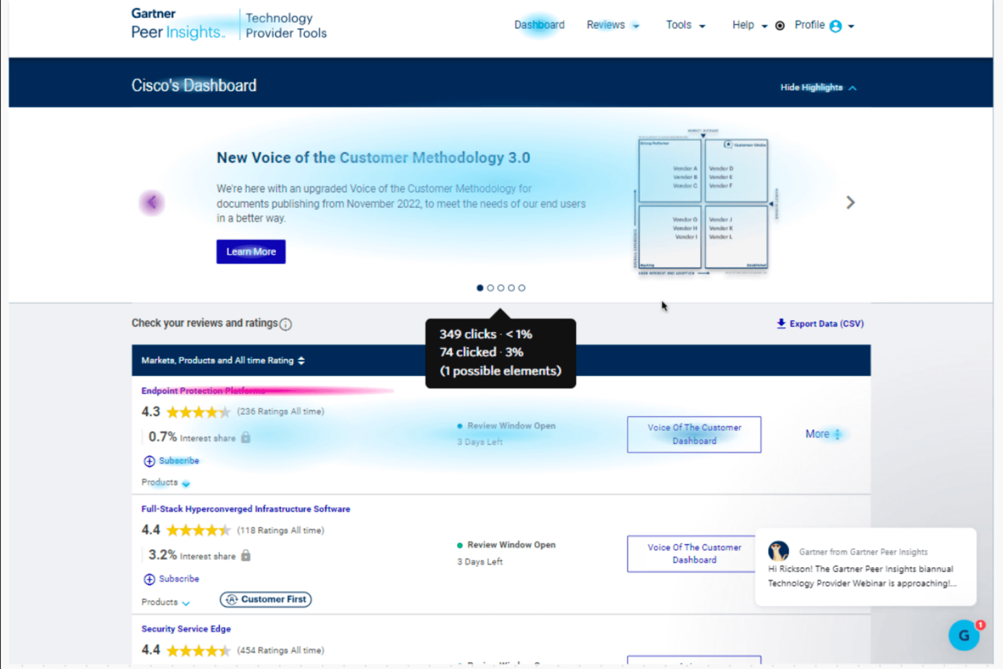
The dashboard or main homepage in a B2B web application should deliver quick insights, highlight key performance indicators (KPIs), and provide clear next steps or action items. However, when evaluating our current TPT dashboard against these standards and comparing it with competitors like G2, Peerspot, TrustRadius, and Trustpilot (refer to attached screenshots), it becomes clear that our dashboard falls short of meeting these expectations.
The dashboard or main homepage in a B2B web application should deliver quick insights, highlight key performance indicators (KPIs), and provide clear next steps or action items. However, when evaluating our current TPT dashboard against these standards and comparing it with competitors like G2, Peerspot, TrustRadius, and Trustpilot (refer to attached screenshots), it becomes clear that our dashboard falls short of meeting these expectations.
Opportunity🤌
How might we revamp the Vendor Portal dashboard to streamline navigation, support key actions, and enhance user engagement?
Opportunity🤌
How might we revamp the Vendor Portal dashboard to streamline navigation, support key actions, and enhance user engagement?
Design Process
Design Process
We began the design process for the dashboard by collaborating with stakeholders to determine how to divide it into different sections. Using research, data, and user interviews, we were able to establish a rough outline of the sections and prioritize them accordingly
We began the design process for the dashboard by collaborating with stakeholders to determine how to divide it into different sections. Using research, data, and user interviews, we were able to establish a rough outline of the sections and prioritize them accordingly
There's a detailed analysis, but I don't want to overwhelm you. Feel free to reach out if you're ever interested. 🥹
There's a detailed analysis, but I don't want to overwhelm you. Feel free to reach out if you're ever interested. 🥹
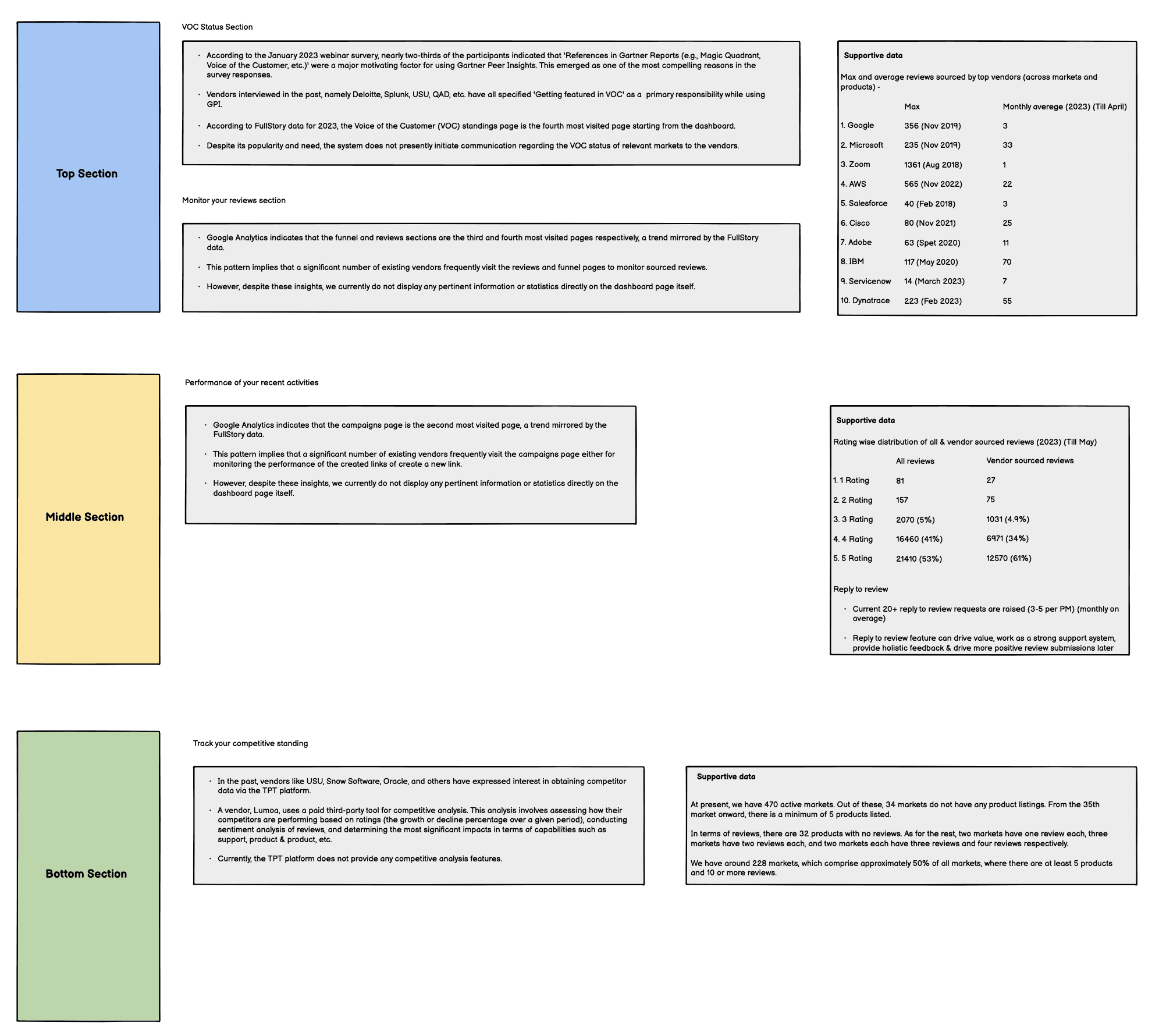
After the analysis, we divided the sections in Balsamiq, with each decision supported by data.
Initial Wireframes and Concepts
Initial Wireframes and Concepts
Initial Wireframes and Concepts
To gather user feedback before finalizing the design, we created wireframes in Balsamiq for user review.
To gather user feedback before finalizing the design, we created wireframes in Balsamiq for user review.
Snapshot of the wireframes created in Balsamiq to gather user feedback before finalizing the design.
User Feedback
User Feedback
User Feedback
We have received feedback from approximately 30 users (as of 25th June, 2023) through various mediums. The breakdown is as follows:
15 user testing sessions (9 UT Audience + 6 TPT Audience)
We have received feedback from approximately 30 users (as of 25th June, 2023) through various mediums. The breakdown is as follows:
15 video interviews (4 with Large enterprises)
15 user testing sessions (9 UT Audience + 6 TPT Audience)
Key Insights from the User Interviews
Key Insights from the User Interviews
Key Insights from the User Interviews
We were able to capture feedback from various individuals, including those in marketing, customer success, product management, and analyst relations. Among vendors who shared their logging frequency in the platform, half of them reported that their frequency might increase with the new dashboard.
For prioritization purposes, the following sections are ranked based on vendor excitement (the numbers below indicate the number of vendors excited about each section):
Track your competitive standing - 7
Performance trend - 7
VOC Status - 7
Tasks progress list - 6
Track your activities - 4
Sourced Reviews - 4
Key Performance metrics - 4
Brief overview of 'Likes and 'Suggestions'
Brief overview of 'Likes and 'Suggestions'
“Much, better, more advanced dashboard cause when we say dashboard, we need to see a lot of things in here.ˮ - Customer marketing manager, TIBCO Software
“Like the key performance metric. Easier to see what you need to see in your marketˮ -Director of analyst relations, Servicenow UX
“Like having both favorable and critical review easily accessibleˮ - Customer marketing manager, Logz.io
“Love the progress tracker. I am pretty sure I am missing a lot of thingsˮ - Marketing lead, Locus “VOC - This is a good analytics, because it tells me my status and if I'm good or I should get reviews.ˮ - Growth product manager, Brandefence
“Love the navigation. So much easierˮ - Product marketing manager, Secureworks
“Much, better, more advanced dashboard cause when we say dashboard, we need to see a lot of things in here.ˮ - Customer marketing manager, TIBCO Software
“Like the key performance metric. Easier to see what you need to see in your marketˮ -Director of analyst relations, Servicenow UX
“Like having both favorable and critical review easily accessibleˮ - Customer marketing manager, Logz.io
“Love the progress tracker. I am pretty sure I am missing a lot of thingsˮ - Marketing lead, Locus “VOC - This is a good analytics, because it tells me my status and if I'm good or I should get reviews.ˮ - Growth product manager, Brandefence
It's a Show Time for Designs!
It's a Show Time for Designs!
It's a Show Time for Designs!
Snapshot of final design post user feedback
Snapshot of final design post user feedback
Other Projects I worked on at Gartner